
Elementor is a powerful website builder that allows you to build beautiful, responsive websites without writing any code effortlessly. With our website design and development services, we can help you take advantage of this powerful plugin for creating stunning websites. We have created this guide to help you understand how Elementor works and learn the key features of Elementor so you can create websites with ease.
Table of Contents:
- What is Elementor?
- How to Login in WordPress?
- How to know if the page is made Using Elementor?
- How to know if it is a page or template?
- Editing a post/page with Elementor
- Understanding the Elementor editor
- Widget in a worm’s eye view
- Drag and Drop widgets
What is Elementor?
According to Hubspot
“Elementor is a drag-and-drop page builder for WordPress. This plugin helps you create beautiful pages using a visual editor.It’s designed for you to build dynamic websites quickly.“
Hubspot.com
In short, Elementor is a WordPress-based Page builder that makes your website design process simple, and it is a great self-help drag and drop tool for your best in class website’s design experience, which gives you total freedom to design your site visually and make it more appealing. So why wait, let’s get started!
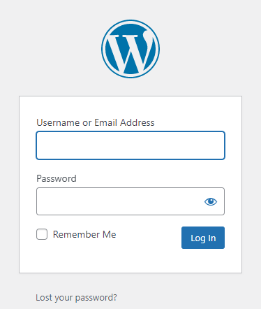
How to Login in WordPress?
In the usual case, we need to login using the /wp-admin extension in the URL. So just type /wp-admin at the end of your URL.
For example:
If your domain is www.example.com
Then your login URL might be www.example.com/wp-admin/
Then you will be redirected to the WordPress login page and now use your username or email and password to login with WordPress. If you don’t remember your password, you may click on the lost password and reset it.
Pro Tip: Never Use “admin” as a username as admin is one of the most common usernames, which is easy to guess and easy to hack.
How to Check If the Page is Made Using Elementor?
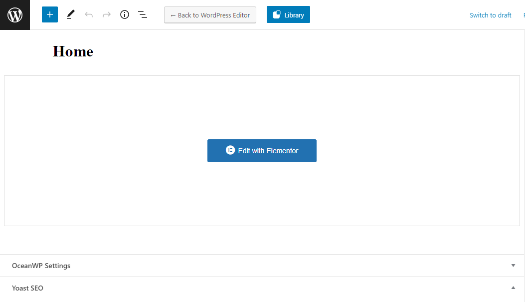
Once you are logged in to the WordPress dashboard, try checking your page in a new tab, open that page in a new window and check if you have an admin bar on the top of that page. It would be a black bar that may look something like this.
If you find Edit with Elementor in the admin bar, there are chances that the post is built with Elementor. However, I would suggest clicking the edit page to try and check if it is actually made with Elementor or if the page is just a template. However, we may talk about the templates in the next point.

While you click on the edit page or edit post, you may find Edit with Elementor, same as the admin bar, then click on Edit with Elementor to check if the page opens in Elementor or not.
Check if it is a page or template
In most cases, the Post templates like Single blog posts or the category page, or the blog’s archive’s page are built using reusable and easily customizable templates. Where we make changes to one template, and it applies to all the blog posts.

- Header
- Footer
- Single Post
- Single Page
- Popup
- Section
- Sidebar
- Custom Sections
And any other custom templates that you build can be found when you hover on Edit with Elementor.
Once you open these templates, you will be able to see some widgets like:
- Post Title
- Post Content
- Categories
- Tags
- Featured Image
- Author
- Sidebar
And more so, there are many other options that are commonly used for blog posts.
Understanding the Elementor editor
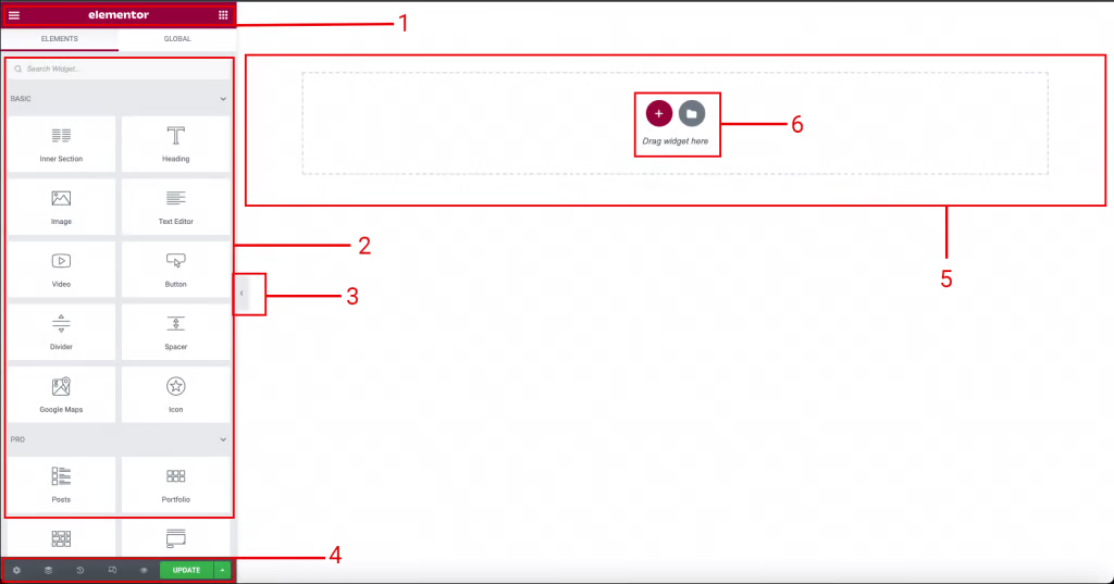
Following are the things descriptions for the markings
- Panel header: Here, there is a settings menu with the hamburger Icon, Elementor branding logo, and A home button that would always lead you to the main Elements Tab from any settings.
- Widgets and Widgets Settings: Widgets area where you may find all the Prebuild and custom widgets with which you may edit any post or pages. You may use these widgets to add new custom sections like forms, videos, accordions, icon boxes, image boxes, etc.
- Fact: Elementor has 33 Free content widgets that come built-in with basic version installation. However, Elementor Pro has 60+ Widgets, including dynamic content and much more.
- Hide Panel / Preview Tab: This is usually used to quickly preview the changes you have made on the page to check and review if you found any changes. Shortcut: You may use Control + P (in windows) or (Command + P) in MAC to toggle this Preview Tab.
- Panel Toolbar: This is an action-oriented section that includes page settings, Tab to open Page Settings, Navigator, History, Responsive View, Preview Changes, and Publish/Update.
- Content area: Where you may drag and drop your content and make the whole page
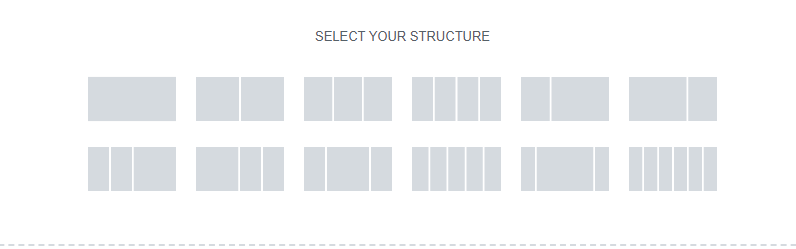
- Add New Section/Template: Here, you may add a new section with 1 to 6 columns layouts and a few more variations of 2-3 column layouts.
The second option here is to select a template where you may select a pre-built template from the library or a custom one too.
Widget from a worm’s eye view
In typography, there are three types of text editing options available.
- Headings / Title widget
- Content (WYSIWYG editor) widget
- Text Path widget
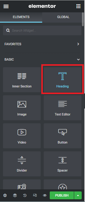
Heading / Title Widget
The heading widget helps add all the custom HTML heading tags from H1 to H6 and more, all such heading text is very easy to use and edit as well.
While you drag and drop the heading, you may see 3 tabs.
Content tab, Style tab, and The Advanced tab
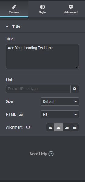
The Content Tab:
These tabs differ from one widget to another, so please don’t consider this for all. It’s just an example of the most commonly used widget.
Title input field: Where you may add the text
Link field: Here, you can past or choose a page’s link/URL in order to make your heading clickable
Size Field: Here, you may choose a size from the following
- Small
- Medium
- Large
- XL
- XXL
HTML Tag Field: As the name suggests, you may be able to add or change the HTML heading tag by choosing the ones available from the following
- H1 (Heading one largest heading on the page best for page title)
- H2 (Heading two best for section’s headings)
- H3 (Heading three best for Medium title)
- H4 (Heading four best for Highlights)
- H5 (Heading five best for List items)
- H6 (Heading six footnotes and subheadings)
- Div (Commonly used anywhere)
- Span (Commonly used to mark up a part of a text or a part of a document)
- P (Most Common for body text)
Items marked in Orange are rarely used, rest are more frequently used items.
Alignment Buttons: Here, you may choose whether you want to align the text on the left, right, or center of the page. You may also justify the text alignment as per your needs.
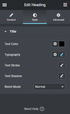
The Style Tab:
These tabs differ from one widget to another, so please don’t consider this for all. It’s just an example of the most commonly used widget.
Text Color: Usually, this is the color for text; it accepts hex code values if you need to add color to the website. However, it has the option to save colors in order to create your own color palette with the most commonly used colors of your brand guide.
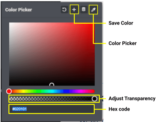
Typography: You can choose whatever font style or font family you want Elementor usually use Google fonts for typography.
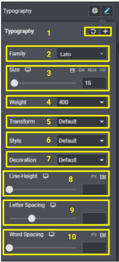
Typography: You can choose whatever font style or font family you want Elementor usually uses Google fonts for typography. Following are the options available in typography
- Save the Typography settings or reset the default settings.
- Family, to choose font family
- Size it’s divided into two sections one is the number value for font size second is the measurement absolute or relative units of measurement.
- Font weight is usually between 300 – 900, which defines how bold you want the font to be
- Transform is the option to change the case of a particular text it has the following options
- UPPERCASE
- lowercase
- Capitalize
- Normal
- Style is used to make text italic or oblique
- Decorations are to add any of the following options
- Underline
- Overline
- Line through
- Line height is used to add space between the lines
- Letter spacing used to add space between the alphabets
- Word Spacing is words itself
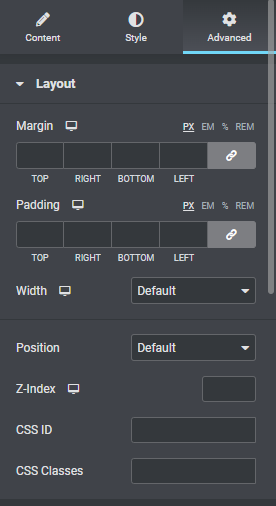
Advanced tab
You may find all the utilities here, which means the margins and paddings responsive width option which are common let’s discuss the complex parts here:
- Position: There, we can use absolute or relative CSS positions click here to click to know how to use
- Z-index: It’s usually used to overlap the items; the higher the z-index value is, the more our selected element would move above the other elements
- CSS ID & CSS Class: They are usually used to define some custom class or IDs. It’s helpful if you are using some custom CSS or js.
- Motions effects: This is used for the animations effects like Bounce, Zooming, and much more
- Transform: It’s the CSS transform functionality Rotate, Offset, Scale, Skew, Flip Horizontal, Flip Horizontal, Flip Vertical.
Background: Used for adding background color for a widget area
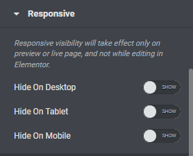
Responsive mode
This is very much helpful to hide or show any of the widget items in desktop, mobile or tablet versions.
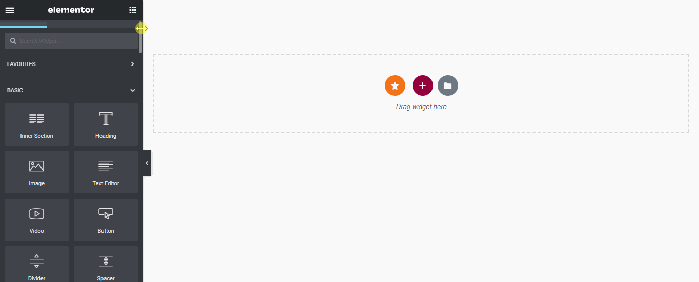
Drag and drop functionality
To drag and drop any item simply pick a widget from the side panel and drop it in the empty area on the right hand side
To Conclude I would say that:
Website Design And Development Services can be challenging to navigate, especially with so many different variables. Regardless of the scope of your project, Elementor’s customizability gives you an immense level of control over every pixel on your website. Whether you are looking for a complete branding overhaul or just a simple feature addition to better appeal to your visitors, Elementor is always ready for the job.


