A good color scheme is key to a good website, digital marketing, and a good internet appearance overall. The colors on a website can be effective digital marketing strategies that support business while also creating an appealing design that appeals to consumers.
Digital marketing consultant acknowledges that as the overall marketing strategy, colors can be used to make a strong statement about the business. The colors chosen for the brand and website reflect on all platforms and consistently communicate. Whether you are reviewing a digital or print project or presenting your ideas to others, understanding color is the first step in ensuring that the message you want to convey is clearly communicated.
Color can have an enormous impact on your website and digital marketing efforts. While it may be tempting to start picking colors for your site without any strategy, that’s not the right way to go about it. Understanding how color affects user behavior will help you make better design choices.
As per custom web design company, when it comes to website design, psychology plays a significant role in how your visitors will respond. Understanding the basics of color psychology will help you predict how your target audience will react to the different sections of your website and can be helpful in your overall strategy. In this post, we’ll discuss some key color combinations proven to help drive engagement with your company or brand.
Most people overlook the color palette they use when creating a website, but this is a significant aspect of web design. Color can change the atmosphere and mood of your website because it has strong emotional symbolism, so choosing colors that are appropriate to your target audience is essential when you’re designing a website. Web Design is not just a pretty face, and if you don’t take the time to understand some of the basics, it won’t be long before your website is ignored or completely neglected.
Color is one of the most potent ways to engage your customers. The right colors and combinations on your website help shape your customers’ views of your brand.
Your website colors say a lot about your brand. Research has shown that the colors used on a site impact buying decisions and how visitors perceive you. To choose the right colors, you need to understand how they affect user experience, brand perception, and emotions.
Color can affect people mentally and physically. Knowing how your target audience will react to different sections of your website is an essential part of effective design.
Color psychology
Color psychology has been used for centuries to help people improve their moods and behavior as it is a powerful tool in visual communication. It has the potential to affect our emotions, cognitions, and behaviors. The right color can make us feel calm and relaxed or excited and energetic. In contrast, some color impacts the website by distracting users from the main content resulting in a bounce from the website.
Research also shows that the perception of certain colors varies between gender, industry, and culture.
The right color can have a major impact on the way your brand is perceived. Whether designing a website, landing page, social media ad, or marketing email, using color psychology wisely can help boost engagement and conversions.
Using color in website design
Increase brand recognition
Understanding and using color in your business website is essential for creating a solid brand and product personality. Color is such an important factor in brand recognition that businesses often use multiple colors for their logos or branding. Companies have trademarked specific shades of color to protect their brand further, and color can influence user perception of a company and product.
Businesses use color to build their image, influence perception, and protect their brands. By identifying iconic shades like Coca-Cola Red and Target’s light blue, companies have been able to trademark various colors to protect them.
Ensure a consistent brand identity throughout all elements when building your website by incorporating your brand colors into everything you create. Making your website using your brand colors will automatically feel like a part of your business rather than just another site on the Internet. This alignment with your brand identity ensures that visitors immediately know who you are and what you do.
Draw attention
Color is a great way to draw attention to some aspects of your website and guide your visitors’ attention to what’s essential. The main areas where you should use color are:
CTA
A well-placed call to action button can help boost conversion rates and increase user engagement. When selecting the color of your CTA, focus on choosing a color that contrasts with the other colors on your website to ensure it stands out and makes it blend into the background so that people will notice it immediately.
Subsections
Contrasting colors are great for highlighting information on your website. Contrasting colors can be used on subsections within the website, like headings or even paragraphs, and may be eye-catching to readers who want to focus on specific information.
For example, if you have a section of your website where you highlight products, an About Us section, or a summary of the latest promotions. You may want to use a light color for this section that will help draw users’ attention to these products and make them stand out from the rest of your page.
Impacts on user’s emotions
Color plays a vital role in determining how users feel about your website. It affects their perception and may be led to increasing or decreasing trust in your brand. When users first hit your website and see the design, they instantly feel what the site is about, which may help grab their attention and guide them towards taking action.
Colors and impact on perception
Color is significant for many reasons, but how can it impact a user’s perception? Let’s take a look at how popular primary colors can affect a user’s perception:
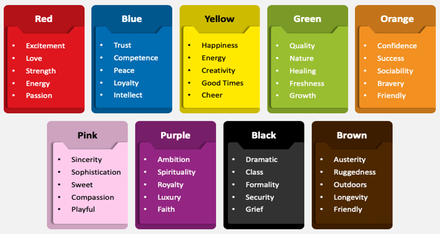
Red
Red is one of the most powerful colors in the world. It is not just one color, it has different shades, and each shade of red portrays a different message. Bright reds are associated with excitement, energy, passion, and desire. Vibrant reds are used to communicate urgency and create an urgency for purchase. Dark reds generate the perception of luxury and high-priced items.
Blue
Blue is the best color to use in your design if you want to capture a sense of trust, confidence, and calmness. A lighter shade can symbolize creativity, while a darker blue is good for highlighting intelligence and trustworthiness. It is also often used to convey a high-quality image due to its association with clean air, water, and sky. Blue is perfect for healthcare, financial, and government institutions.
Green
Green is a color that naturally attracts people. It represents balance and harmony, so it portrays the feeling of care, calmness, and wellness. Green is also a versatile color that can be interpreted in many ways by varying lighting, hue, and tone. It’s often associated with nature, which explains why it’s often tied with environmentalism or health/wellness.
Yellow
Yellow is a color of energy and warmth. It has a positive, happy, sunshine-like energy that can generate feelings of interest, excitement, and optimism. It’s an uplifting color that stimulates new ideas for products or services, making yellow the perfect choice for any brand wanting to promote newness and growth.
Orange
Orange is a fun, out-of-the-ordinary color. Orange is bright and refreshing but also has a warmth, ideal for expressing urgency, durability, and confidence. Orange is one of the most attention-grabbing hues in our product lineup, so you can use orange to make sure your product gets noticed.
Purple
Purple is a versatile and spiritual color that can be used to express a range of emotions and ideas. It symbolizes royalty, wealth, and luxury. On the other hand, a light purple color reflects sophistication and class, while a darker purple highlights mystery and luxury.
Black
Ever wondered why luxury stores have dark interiors and products? Black is the color of luxury and sophistication that should not be limited to the basics. It’s universally associated with success, elegance, and wealth. Black can be used to appeal to a wealthier client than your current customers or as an opportunity to create contrast on your website. It may invoke feelings of authority and responsibility.
White
The color white is a blank slate and can be used to create an environment with a minimalistic, modern feel. White is friendly and inviting to people and can create a bright, modern feel if paired with dark hues. It is used to show sophistication and class, as well as creativity.
Does color psychology matter for SEO?
Color psychology has been a powerful tool and weapon for centuries. It’s not just humans who respond to color. Many animals do too. We don’t need to use words as our brains are hard-wired to connect with color. The impact of a certain color on behavior may be limited, and the effects are usually temporary. Website color plays a crucial part in communicating your brand and website’s message. Overusing specific colors such as yellow or red can overwhelm the user and create visual fatigue if not careful. Using too much black might not generate enough contrast or encourage any action on the page, which may affect your SEO. Optimizing your website design with the right colors can boost taking action, make your website appear welcoming or more professional.
Color is one of the most significant aspects of user experience as it communicates to your customers. If a color is too overpowering or distracting, it can cause people to tune out your content. On the other hand, choosing indistinct or uninteresting colors might make your site difficult to read and navigate.
The right colors in the right places on your website design can encourage taking action, make it appear more friendly and optimistic, or tell a story about your brand. Too little can dull the page or lack focus, affecting your SEO.
Wrapping up
Color Psychology affects how we perceive the world around us. Understanding color psychology is about creating the right tone for your brand and influencing user perception. Knowing more about color psychology does not mean you have to update the whole design of your website. Instead, consider what colors you want to use and how they are perceived, and then apply them accordingly to help in website traffic.