Keywords: Digital Marketing Consulting Agency, SEO service experts
Creating content has become a priority in the constantly changing digital marketing landscape. The strategies and tactics that were used to work may have outlived their usefulness. Finding new and exciting ways to engage audiences is essential in today’s marketing landscape, and creating the right content across all platforms is paramount.
As per a digital marketing consulting agency, content marketing aims to inspire customers and prospects to act on your offerings. To do this effectively, you must have an understanding of creating content available on all channels, including websites and social media platforms, to increase brand awareness. While creating content, infographics are one of the best tools for effectively communicating complex information. By combining visuals with informative content, they become one of the most engaging types of content across social media and all other channels, including websites
What is an Infographic?
Infographics, also known as data visualization, are a versatile and effective form of communication tool. It can be used to visualize raw data or summarise complex concepts, making them ideal for helping people better understand your content.
Infographics are a time-tested and fun way to grab attention and help your audience remember essential information about your products and services. With the right design, they can also help you build trust with your audience by telling a compelling story that conveys the right message.
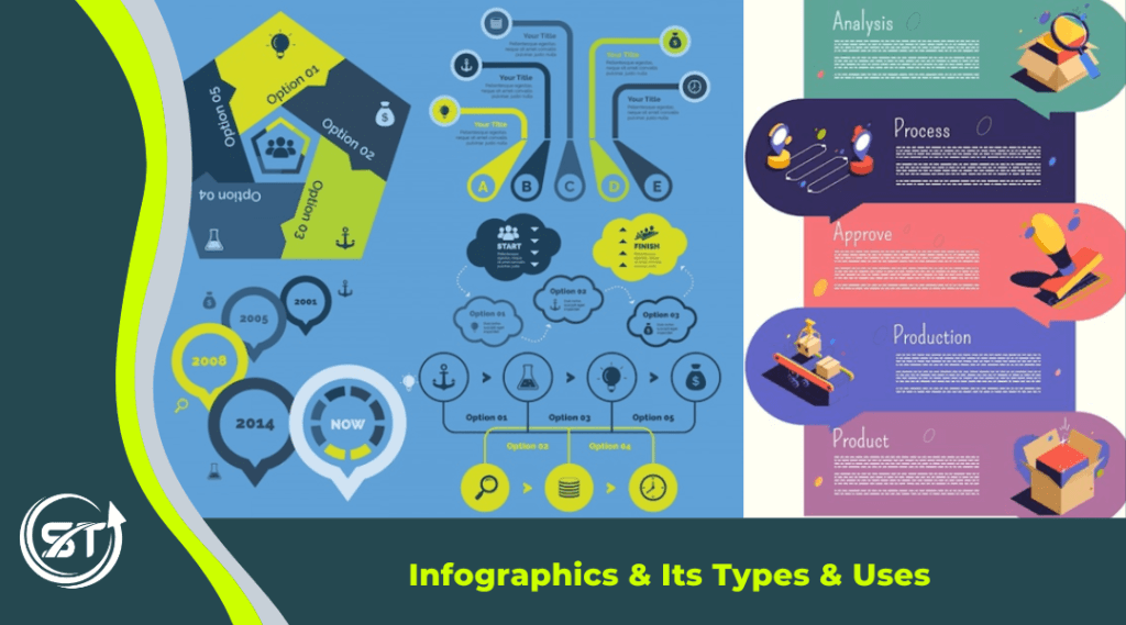
Types of Infographics and How to Use Them
Infographics are considered a saving grace for small brands in content marketing. When it comes to visualizing information, infographic design can take many forms. These are a great way to present your company’s ideas, products and services in a more affordable way than videos, as they will be more effective for stirring engagement on social media platforms in the form of graphs, charts, diagrams and maps. Infographics can be used to explain hard concepts by using simpler mediums like pictures, colours and figures, similar to how we select colors to design our website. The following are types of infographics:
Visual Infographics
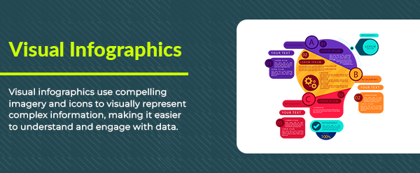
Visual infographics are a great way to bring your content alive by incorporating images and graphics the reader can relate to, which can be more interesting than simply reading a long block of text. Visuals often include cartoon-based graphics and text, asking the reader to visualize what they see before actually reading it. It allows you to bring your data to life in an engaging, memorable way by using colour, texture and animation in your design. Visual infographics can tell people more about your brand or product and make stories and experiences more accessible.
Timeline Infographics
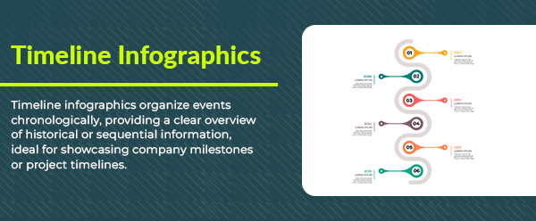
Timeline infographics are a handy way to show the relationship between events or provide an overview timeline of essential things on your site. It can also be used to break down historical events by specific periods. It is a great way to show the evolution and progression of many topics, including world events, technological advancements and scientific discoveries.
Statistical Infographics
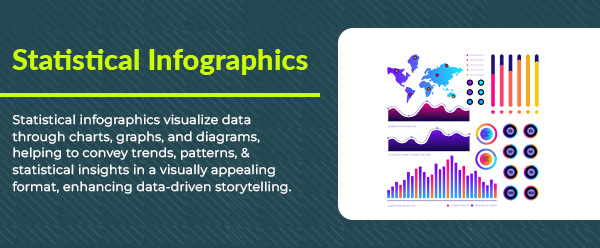
Statistical infographics are another type of infographic that can help you engage your audience. It can display and compare numbers in various ways, from bar graphs and pie charts to line plots and scatterplots. This allows your audience quickly grasp the information you’re trying to share with them. Statistical infographics can be helpful in many different industries, like finance, medicine, education, and more.
List-based Infographics
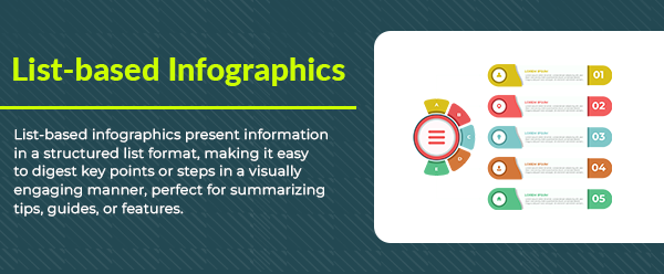
A list-based infographic is an informational graphic that uses a written list to convey a message. A list is divided into sections, each bearing a heading and sometimes subheadings. This places your top resources in an easy-to-digest format. Above all, a list-based infographic is excellent when you have a list of information you want to share with others. Using lists in infographics can help people find relevant ideas, encourage readers to share the infographic, and make it easier for readers to skim the information.
Map Infographics
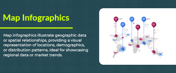
Map infographics are a great way to show information about the world. Using a map, a reader can learn where something is located and even where else to find similar items. This infographic uses a map to convey relevant information to that particular area. This type of infographic allows you to show your audience where information is coming from, how far it is spread out across the globe, what trends are happening in various regions, and other types of relationships.
Comparison Infographics
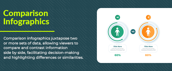
Comparison charts are a great way to compare two or more options. This type of infographic helps readers understand the distinction between various concepts and, in many cases, choose which option is best for them. This is an excellent format if you have multiple options to compare, such as food, shoes, watches, earphones, credit cards, laptops or mobile phones etc.
Food comparison infographics are a great way to communicate facts engagingly and persuasively based on the nutritional value of 2 similar foods. You can mix charts and graphs in comparison infographics for more visual comparison. You can even use data fields or other supplements to the infographic to make it easy to understand and absorb.
Step-by-Step Infographics

A step-by-step infographic is a guide that provides an understandable and easy-to-follow visual outline of how to complete a specific action or series of activities. Ready-to-eat food, hand-washing signboards and even the instruction manuals in your microwave combines the step-by-step format with graphics to make it easy for people of all abilities to understand information.
Hierarchy Infographics
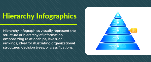
Hierarchy infographics are great for showing hierarchy within a company or illustrating the varying importance of different pieces of data. It uses colour, position, and size to represent the relative importance of text or visual elements in an infographic, with size optimized to ensure it won’t affect the page loading speed, which may impact the user experience though it is good as a user interface. Colours such as yellow and red highlight more critical information, while blue and green are used for less important information.
Hierarchy infographics represent the flow and structure of a business, organization, or project. It shows how the employees, groups and departments fit into the company hierarchy. Hierarchy infographics are often shown in a pyramid, with the top of the pyramid representing the top of the hierarchy.
Wrapping Up
As per SEO service experts, infographics are highly effective in explaining your brand’s message and are among the most effective types of content on the web. The visual nature of infographics helps people to understand even the most complex ideas, making them also great for sharing on social media sites.